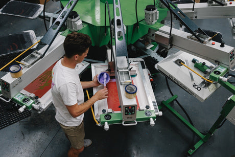
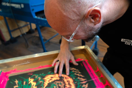
Creating custom t-shirts is an exciting journey, whether you're designing for your business, event, or personal style. However, even the most creative minds can fall into common traps that turn a brilliant concept into a disappointing final product. At The Tee, Australia's premier destination for custom t-shirt printing using premium AS Colour blanks, we've seen these mistakes countless times. Learn from others' experiences and ensure your custom tee design stands out for all the right reasons.
Mistake #1: Ignoring the Fabric and Fit
One of the biggest oversights in custom t-shirt design is failing to consider how your design will interact with the fabric and fit of the garment. Many designers focus solely on the visual elements without thinking about how the design will look when stretched across different body types or how it will behave on various fabric weights.
The Problem: Your design might look perfect on screen, but when printed on a fitted tee that stretches across the chest, text can become distorted, and images may lose their proportions. Similarly, designs that work beautifully on lightweight fabrics might appear muddy or lose detail on heavier cotton blends.
The Solution: Always consider your canvas. AS Colour's premium blanks come in various fits and fabric weights, each offering different characteristics. A relaxed fit provides more stable printing surface, whilst a slim fit requires careful consideration of stretch zones. Before finalising your design, visualise how it will appear on the actual garment you've chosen. Consider the neckline, seams, and natural drape of the fabric.
At The Tee, our team can advise on which AS Colour styles work best with your specific design requirements, ensuring your vision translates perfectly to the final product.
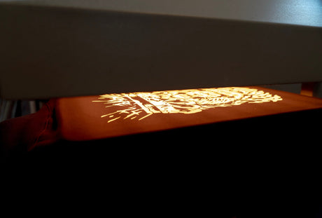
Mistake #2: Poor Resolution and Image Quality
Nothing ruins a professional-looking custom tee faster than pixelated graphics or blurry text. This mistake is particularly common when designs are created for social media or web use and then directly applied to print without considering the resolution requirements.
The Problem: Images that look crisp on your computer screen at 72 DPI will appear pixelated and unprofessional when printed. Vector graphics that haven't been properly prepared can result in jagged edges, whilst low-resolution photos will lose detail and appear fuzzy on fabric.
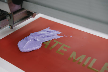
The Solution: Always work with high-resolution files. For raster images, aim for at least 300 DPI at the actual print size. Better yet, use vector graphics (SVG, AI, or EPS files) whenever possible, as these can be scaled infinitely without quality loss. If you're working with photographs, ensure they're high-resolution originals rather than compressed web images.
Professional design software like Adobe Illustrator or even free alternatives like Canva's pro features can help ensure your designs meet print specifications. Remember, it's always better to have a file that's too large than too small – we can always scale down, but scaling up will result in quality loss.
Mistake #3: Overwhelming Design Complexity
Whilst creativity should never be stifled, there's a fine line between eye-catching and overwhelming. Many first-time designers try to cram too many elements, colours, or messages into a single design, resulting in a cluttered, confusing final product.
The Problem: Complex designs with numerous small details often lose impact from a distance – the very distance at which most people will view your t-shirt. Multiple fonts, gradients, and intricate patterns can muddle your message and create production challenges. Additionally, complex designs often translate poorly to different printing methods and can significantly increase costs.
The Solution: Embrace simplicity and focus on a single, strong concept. Choose one primary message or image as your focal point and build around it minimally. Limit your colour palette to 2-4 colours for screen printing, or design with single-colour prints in mind for cost-effective production.
Consider the "5-second rule" – if someone can't understand your design's message within five seconds of seeing it, it's likely too complex. Remember, some of the most iconic t-shirt designs in history are beautifully simple: think of classic band tees or iconic logos.
Mistake #4: Incorrect Sizing and Placement
Even the most brilliant design can fall flat if it's poorly positioned or sized inappropriately for the garment. This mistake often stems from designing in isolation without considering the human form that will wear the final product.
The Problem: Designs that are too large can wrap uncomfortably around the torso or extend into awkward areas like underarms. Conversely, designs that are too small can appear lost on the garment and lack impact. Poor vertical placement can result in designs that sit uncomfortably high near the collar or too low near the hem.
The Solution: Follow standard sizing guidelines as your starting point. For chest prints, a good rule of thumb is 28-30cm wide for adult sizes, positioned approximately 7-10cm down from the collar seam. However, these measurements should be adjusted based on the specific garment style and your design's requirements.
Always request a digital mockup before production. At The Tee, we provide detailed previews showing how your design will appear on the actual AS Colour garments you've selected. This allows you to make necessary adjustments before printing begins.
Consider creating templates for different garment sizes if you're planning multiple variations. What looks perfect on a small might need repositioning for larger sizes to maintain visual balance.
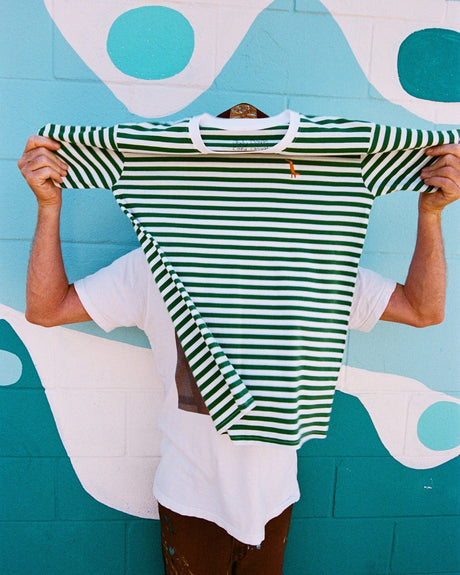
Mistake #5: Neglecting Colour Theory and Contrast
Colour selection can make or break your custom tee design. Many designers choose colours based purely on personal preference without considering how they'll work together or against the garment colour, leading to designs that lack impact or readability.
The Problem: Poor colour choices can result in designs that disappear against the garment colour, create uncomfortable visual vibrations, or simply don't photograph well for social media sharing. Additionally, certain colour combinations can be difficult or expensive to reproduce accurately in print.
The Solution: Start with contrast – ensure your design elements stand out clearly against your chosen garment colour. Dark designs work beautifully on light garments and vice versa. For mid-tone garments, consider using both light and dark elements within your design for maximum versatility.
Understand colour psychology and how different hues evoke various emotions. Consider your target audience and the message you want to convey. Red creates energy and urgency, blue suggests trust and professionalism, whilst green conveys growth and harmony.
AS Colour's extensive range includes beautiful colours from classic whites and blacks to trending seasonal shades. At The Tee, we can help you select garment colours that complement your design whilst ensuring excellent printability and longevity.
Getting It Right with The Tee
Avoiding these common mistakes doesn't mean compromising on creativity – it means channeling that creativity more effectively. Every successful custom t-shirt starts with understanding the medium, respecting the process, and working with experienced professionals who understand both design and production.
At The Tee, we're passionate about helping Australians create custom t-shirts they're proud to wear and share. Our expertise with AS Colour's premium blanks, combined with state-of-the-art printing technology, ensures your vision becomes reality without falling victim to these common pitfalls.
Whether you're designing your first custom tee or your hundredth, remember that great design is about effective communication, not just aesthetic appeal. Keep these mistakes in mind, focus on clarity and quality, and you'll create custom t-shirts that not only look professional but effectively convey your message to the world.
Ready to bring your design to life? Contact The Tee today, and let's create something amazing together – mistake-free.