Typography can make or break your custom t-shirt design. The right font doesn't just communicate your message – it amplifies it, creates emotional impact, and ensures your design looks professional and polished. With countless typefaces available, choosing the perfect font for your custom tee might seem overwhelming, but understanding the principles of effective t-shirt typography will guide you to selections that truly stand out.
At The Tee, we've seen how the right typography transforms good designs into great ones. Our comprehensive font library, combined with premium AS Colour blanks and professional printing techniques, ensures your typographic choices translate beautifully from screen to fabric. Here's everything you need to know about selecting fonts that make your custom tees genuinely memorable.
Why Typography Matters in Custom T-Shirt Design
Typography serves multiple crucial functions in custom apparel design, extending far beyond simply displaying text. The fonts you choose communicate personality, establish hierarchy, enhance readability, and contribute significantly to the overall aesthetic impact of your design.
Brand Personality Communication: Different fonts convey dramatically different personalities. A bold, industrial font like Impact suggests strength and confidence, whilst a playful script like Lobster communicates friendliness and creativity. Your font choice should align perfectly with your intended message and brand personality.
Readability and Distance: Custom t-shirts are viewed from various distances, from close conversations to across crowded rooms. Effective t-shirt typography must remain legible whether someone is reading it up close or glimpsing it from across a busy event space.
Printing Considerations: Different fonts reproduce differently across various printing methods. Fine details, thin strokes, and complex letterforms that look crisp on screen may not translate well to fabric, particularly in smaller sizes or when using certain printing techniques.
Cultural and Demographic Relevance: Font choices should resonate with your target audience whilst considering cultural context and generational preferences. What appeals to teenagers might not work for corporate professionals, and vice versa.
Categories of Fonts Perfect for Custom Tees
Understanding font categories helps narrow your choices and ensures you select typefaces appropriate for your specific design goals and printing requirements.
Sans Serif Fonts – Clean and Modern: Sans serif fonts lack the decorative strokes found in traditional serif typefaces, making them excellent for custom t-shirts where clarity and modern appeal are priorities.
Arial Black from The Tee's font collection exemplifies the power of bold sans serif typography. Its thick, uniform strokes ensure excellent readability even at smaller sizes, whilst its clean geometry communicates professionalism and modernity. This makes it perfect for corporate events, team uniforms, and designs requiring maximum legibility.
Bebas Neue offers a more condensed sans serif option that's become incredibly popular in contemporary design. Its tall, narrow letterforms allow for impactful headlines without overwhelming the design space, making it ideal for bold statements and contemporary branding.
Script and Handwritten Fonts – Personal and Artistic: Script fonts add personality and human touch to custom t-shirt designs, though they require careful consideration for readability and printing quality.
Lobster provides an excellent balance between script elegance and print-friendly readability. Its bold strokes and clear letterforms ensure it reproduces well in custom printing whilst maintaining the warmth and personality that script fonts offer. It works beautifully for boutique brands, creative businesses, and designs targeting artistic demographics.
Homemade Apple offers a more casual, handwritten aesthetic that's perfect for personal projects, family events, and brands wanting to convey authenticity and approachability. Its irregular letterforms suggest hand-crafted quality whilst remaining highly readable.
Display and Decorative Fonts – Maximum Impact: These fonts are designed to grab attention and work best for headlines, logos, and designs where typography is the primary visual element.
Bangers exemplifies effective display typography for t-shirts. Its comic book-inspired letterforms create immediate visual impact whilst maintaining excellent readability. This font works exceptionally well for youth-oriented designs, creative projects, and any application where energy and fun are key messaging elements.
Graffiti offers urban edge and street credibility, perfect for brands targeting younger demographics or designs with alternative aesthetic approaches. Despite its decorative nature, it maintains readability essential for effective t-shirt typography.
The Tee's Font Selections: Professional Choices for Every Project
The Tee's carefully curated font library includes options proven to work exceptionally well for custom t-shirt printing, ensuring both aesthetic appeal and technical reproduction quality.
Classic and Reliable Options:
Arial Rounded softens the typical geometry of sans serif fonts whilst maintaining excellent readability. Its friendly appearance works well for community organisations, children's events, and brands wanting to appear approachable yet professional.
American Typewriter brings vintage appeal with modern reliability. Its slab serif construction ensures excellent printing whilst evoking classic American design traditions. This font works beautifully for heritage brands, vintage-themed events, and designs requiring nostalgic authenticity.
Contemporary and Trendy Selections:
ChunkFive and ChunkFive 2 represent bold, contemporary display fonts perfect for making strong statements. Their thick strokes and unique character shapes create immediate visual impact whilst ensuring excellent printability across various t-shirt printing methods.
Orbitron provides futuristic, technology-inspired typography ideal for tech companies, gaming events, and designs targeting digital-native audiences. Its geometric construction and sci-fi aesthetic communicate innovation and forward-thinking.
Specialised and Thematic Options:
Varsity captures collegiate sporting aesthetics, perfect for team uniforms, educational institutions, and designs evoking school spirit and athletic achievement. Its bold, condensed letterforms work exceptionally well for numbers and short text phrases.
Stencil suggests military or industrial applications whilst offering excellent printability due to its cut-out design origins. This font works well for utility-focused brands, security services, and designs requiring authoritative, no-nonsense communication.
Keep Calm references the famous British wartime poster series, providing instant recognition and cultural connection. This font works particularly well for motivational messages, British-themed designs, and applications leveraging historical design references.
Font Pairing and Hierarchy in T-Shirt Design
Successfully combining multiple fonts in custom t-shirt designs requires understanding typographic hierarchy and ensuring complementary rather than competing relationships.
Establishing Hierarchy: Use different font weights, sizes, and styles to guide viewers through your design logically. Primary messages should use the most prominent typography, with supporting information scaled and positioned appropriately.
Complementary Pairing: Combine fonts from different categories for visual interest without confusion. For example, pairing the bold display impact of Bangers for headlines with the clean readability of Arial Rounded for supporting text creates effective contrast whilst maintaining design cohesion.
Consistency Principles: Maintain consistent spacing, alignment, and colour relationships between different fonts in your design. Even when using contrasting typefaces, unified spacing and positioning create professional, cohesive results.
Testing Combinations: Always test font combinations at actual printing size to ensure readability and visual appeal translate from screen to fabric. What works digitally doesn't always work in physical printing.
Size, Spacing, and Readability Considerations
Effective t-shirt typography requires careful attention to technical details that ensure your message remains clear and impactful across different viewing conditions and printing methods.
Minimum Size Guidelines: Text smaller than 12-point (approximately 4mm) may not reproduce reliably in custom t-shirt printing, particularly with certain printing methods or on textured fabrics. Always test small text sizes with your chosen printing technique.
Letter Spacing Optimisation: Fonts designed for screen or print media may require spacing adjustments for optimal t-shirt reproduction. Slightly increased letter spacing often improves readability, particularly for condensed fonts like Bebas Neue or decorative options like RockSalt.
Line Spacing Considerations: Multi-line text on t-shirts benefits from generous line spacing to prevent crowding and maintain readability from typical viewing distances. Consider how line spacing affects overall design balance and visual hierarchy.
Colour and Contrast: Ensure sufficient contrast between text and background colours, considering that t-shirt printing may produce slightly different colour relationships than screen displays. Test critical text/background combinations with actual fabric samples when possible.
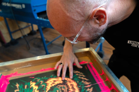
Printing Method Compatibility
Different custom t-shirt printing methods have varying requirements and limitations that affect font choice and sizing decisions.
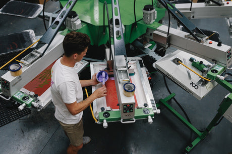
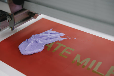
Screen Printing Considerations: Screen printing excels with bold, simple fonts but may struggle with very fine details or extremely thin letterforms. Fonts like Impact, Cooper, or Heavitas work exceptionally well with screen printing due to their bold construction and clear shapes.
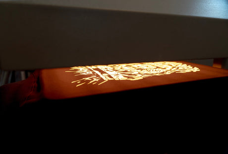
Direct-to-Garment (DTG) Advantages: DTG printing can handle more detailed fonts and smaller text sizes than traditional screen printing. This makes decorative fonts like Permanent Marker or detailed scripts like Love Ya Like A Sister viable options for DTG applications.
Heat Transfer Applications: Vinyl heat transfer works best with fonts that have clean, continuous letterforms without fine interior details. Simple sans serif fonts or bold scripts typically produce the most reliable results with this printing method.
Embroidery Requirements: If considering embroidery for text elements, choose fonts with substantial stroke width and avoid very small sizes. Fonts like Arial Black or ChunkFive typically embroider more successfully than thin or decorative options.
Cultural Context and Australian Typography Preferences
Understanding Australian cultural context and design preferences helps ensure your font choices resonate with local audiences whilst maintaining international appeal where appropriate.
Australian Design Aesthetics: Australian design culture generally favours clean, unpretentious typography that communicates clearly without unnecessary decoration. Fonts like Bebas Neue, Arial Rounded, or American Typewriter align well with these preferences whilst offering distinctive character.
Multicultural Considerations: Australia's diverse population means considering how different cultural groups might interpret various typographic styles. Generally, clear, readable fonts with universal appeal work best for broad demographic targeting.
Industry-Specific Expectations: Different Australian industries have established typographic conventions. Corporate environments typically favour clean sans serif fonts, whilst creative industries allow for more experimental choices. Understanding these expectations helps ensure appropriate font selection.
Trends vs Timeless Typography
Balancing contemporary typography trends with timeless appeal ensures your custom t-shirts remain attractive and relevant over time.
Current Typography Trends: Contemporary t-shirt typography often features bold, condensed fonts, mixed font weights, and vintage-inspired typefaces. Fonts like Bebas Neue, ChunkFive, and American Typewriter reflect current design trends whilst maintaining classic appeal.
Timeless Choices: Some fonts transcend trends due to their fundamental design quality and versatility. Arial Black, Impact, and Cooper have remained popular for decades because they consistently deliver clear communication and aesthetic appeal.
Strategic Selection: Consider your design's intended lifespan when choosing fonts. Event-specific or campaign-focused designs might leverage trendy fonts for maximum contemporary impact, whilst corporate uniforms or long-term branding should favour more timeless options.
Custom Typography and Brand Development
For businesses and organisations developing long-term brand identity, consistent typography choices create recognition and professional credibility.
Brand Typography Systems: Establish primary and secondary font choices that work across different applications, from business cards to custom t-shirts. This consistency builds brand recognition and professional appearance.
Scalability Testing: Ensure chosen fonts work effectively across different sizes and applications. Your brand font should look equally good on large t-shirt graphics and small embroidered logos.
Licensing Considerations: The Tee's font library includes properly licensed typefaces suitable for commercial use, eliminating concerns about usage rights for business applications.
Testing and Optimisation Process
Successful typography selection requires systematic testing to ensure optimal results in final production.
Digital Testing: Create mockups using actual t-shirt templates to visualise how fonts will appear on different garment colours and styles. This helps identify potential contrast or sizing issues before production.
Print Testing: For critical projects, create physical test prints at actual size to evaluate readability, print quality, and overall aesthetic appeal. This step prevents costly mistakes and ensures satisfaction with final results.
Audience Testing: Gather feedback from target audience members about font choices, readability, and aesthetic appeal. This input helps refine selections for maximum effectiveness.
Production Consultation: Work with experienced printing professionals like The Tee team to optimise font choices for your specific printing method and requirements. Professional guidance prevents technical issues and enhances final quality.
Making Your Typography Selection
With understanding of typography principles and The Tee's font options, you're equipped to make informed decisions that enhance your custom t-shirt design's impact and effectiveness.
Alignment with Purpose: Choose fonts that support your design's primary purpose, whether that's building brand recognition, communicating specific messages, or creating aesthetic appeal for your target audience.
Technical Compatibility: Ensure your font choice works well with your chosen printing method and production requirements. The Tee's team can provide guidance on optimal font/printing method combinations.
Long-term Satisfaction: Consider how your font choice will age and whether it will continue meeting your needs over time. Quality typography investments pay dividends in sustained design effectiveness.
Ready to create custom t-shirts with typography that truly stands out? Explore The Tee's comprehensive font library and discover how professional typography, combined with premium AS Colour blanks and expert printing, can transform your design vision into exceptional custom apparel. Contact us today to begin your typography-focused design journey and create custom tees that make lasting impressions through the power of great type.