Staying ahead of colour trends can make the difference between custom t-shirts that look dated and designs that feel fresh and contemporary. As we navigate 2025, certain colours are dominating both fashion runways and street style. At The Tee, we've analysed the latest colour forecasts to bring you the top 5 trending t-shirt colours that will elevate your custom prints on premium AS Colour blanks.
Why T-Shirt Colour Trends Matter
The right colour choice can transform your custom apparel from ordinary to extraordinary. Trending colours not only ensure your designs feel current and relevant but also influence how your brand, team, or message is perceived. In 2025, we foresee powdery pastels (icy blue and petal pink), saturated tones of green and red, and a certain shade of brown taking over the fashion world.
Benefits of choosing trending colours:
• Creates immediate visual appeal and relevance
• Appeals to contemporary aesthetic preferences
• Enhances brand perception and modernity
• Increases engagement and memorability
• Shows awareness of current cultural movements
The Top 5 T-Shirt Colour Trends for 2025
1. Mocha Mousse Brown - The Colour of the Year
Pantone just announce their 2025 Colour of the Year as the Rhode-friendly "Mocha Mousse" to reflect "little treat culture", making warm browns the ultimate trending choice for custom t-shirts this season.
Why Mocha Mousse works for t-shirts:
• Sophisticated yet approachable tone
• Complements all skin tones beautifully
• Perfect for both corporate and casual designs
• Works excellently with gold, cream, and white prints
• Appeals to luxury and premium positioning
Best applications:
Corporate team wear, premium brand merchandise, autumn event apparel, coffee shop uniforms, luxury hospitality staff
AS Colour options: Look for warm brown and chocolate tones in The Tee's AS Colour range, particularly the Block Tee and Staple Tee in earth-toned colourways.
2. Sage Green - Nature's Calming Influence
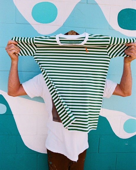
Soothing sage greens continue to dominate colour forecasts as consumers seek calming, nature-inspired hues that promote wellbeing and environmental consciousness.
Why sage green is trending:
• Reflects growing environmental awareness
• Provides calming psychological effects
• Versatile enough for various demographics
• Photographs beautifully for social media
• Complements the wellness and mindfulness movements
Perfect for:
Wellness brands, eco-friendly companies, outdoor activity groups, yoga studios, sustainable fashion, mental health awareness campaigns
Design combinations: Sage green pairs beautifully with cream, soft pink, navy, or crisp white prints. Consider natural imagery, minimalist typography, or botanical elements.
3. Icy Pink - The Evolution of Millennial Pink
Seen as a natural evolution of millennial pink, icy pink takes on a subtler tone in 2025 and blends easily with greys, whites, and metals. This sophisticated pastel offers all the appeal of pink with contemporary restraint.
Why icy pink works now:
• More sophisticated than bright pinks
• Gender-neutral appeal in subtle tones
• Perfect for premium and luxury positioning
• Photographs well in various lighting
• Appeals to Gen Z and millennial aesthetics
Ideal applications:
Beauty brands, creative agencies, fashion retailers, lifestyle brands, female-focused events, premium hospitality
Print colour recommendations: Deep navy, charcoal grey, or metallic foils create striking contrast against icy pink bases, whilst white provides clean, minimalist appeal.
4. Vibrant Yellow - Optimism and Energy
Vibrant yellows represent optimism and energy, reflecting a cultural shift towards positivity and joy after challenging global periods. Yellows are vibrant and reflective and can create a happy and bright environment.
Yellow's psychological impact:
• Instantly grabs attention and creates energy
• Associated with happiness and optimism
• Excellent for brand recall and recognition
• Works brilliantly for promotional materials
• Creates memorable visual impact
Best uses:
Event staff t-shirts, promotional campaigns, children's groups, safety and high-visibility applications, summer festivals, sports teams
Design considerations: Yellow bases work best with dark prints (black, navy, deep purple) for maximum readability. Consider the vibrancy level - softer buttery yellows offer more versatility than electric tones.
5. Deep Teal - Sophisticated and Trustworthy
Deep teal combines the calming properties of blue with the refreshing qualities of green, creating a sophisticated colour that conveys trust, stability, and innovation. This colour bridges the gap between professional and creative applications.
Why deep teal is trending:
• Professional yet distinctive appearance
• Appeals to both traditional and modern aesthetics
• Works across various age demographics
• Excellent for both men's and women's styles
• Conveys reliability and expertise
Perfect applications:
Corporate teams, medical practices, technology companies, educational institutions, professional service providers, conference apparel
Complementary colours: Deep teal works beautifully with coral, cream, gold, silver, or crisp white prints. It's sophisticated enough to carry minimal designs or detailed graphics.
How to Choose the Right Trend Colour
Consider Your Audience
Corporate environments: Mocha mousse and deep teal offer sophistication
Creative industries: Icy pink and sage green appeal to artistic sensibilities
Youth markets: Vibrant yellow and icy pink resonate with younger demographics
Health and wellness: Sage green aligns with industry values
Premium brands: Mocha mousse and icy pink suggest luxury
Think About Print Compatibility
Different trending colours work better with various print methods and colours:
Screen printing: Bold colours like yellow and teal provide excellent opacity for lighter print colours
DTG printing: All trending colours work well, especially for complex, multi-colour designs
Heat transfer vinyl: Darker base colours (mocha mousse, deep teal) create striking contrast with light vinyl
Embroidery: All trending colours provide good contrast for thread colours
Seasonal Considerations
Summer months: Icy pink and vibrant yellow feel fresh and energetic
Autumn/Winter: Mocha mousse and deep teal offer seasonal appropriateness
Year-round versatility: Sage green works across all seasons
Event timing: Consider when your t-shirts will be worn most frequently
AS Colour's Trending Options
The Tee's partnership with AS Colour ensures access to the latest colour trends in premium quality blanks:
Staple Tee range: Often features trending colours in soft, comfortable cotton
Block Tee options: Heavier weight versions of trending colours for durability
Classic Tee selection: Relaxed fit trending colours for casual applications
Seasonal updates: AS Colour regularly introduces new colourways aligned with trends
Colour Matching and Consistency
Pantone references: Professional colour matching ensures brand consistency
Batch consistency: AS Colour's quality control maintains colour accuracy
Fade resistance: Premium fabrics hold trending colours through multiple washes
Size consistency: Colours remain consistent across all garment sizes
Making Trending Colours Work for Your Brand
Brand Alignment
Consider how trending colours align with your existing brand palette:
Complement existing colours: Use trends as accent colours if they don't match your primary palette
Seasonal campaigns: Incorporate trending colours for limited-time promotions
Sub-brand opportunities: Use trending colours for special editions or events
Evolution strategy: Gradually incorporate trends to refresh brand perception
Design Integration Tips
Typography choices: Ensure text remains readable on trending colour backgrounds
Logo adaptations: Consider how your logo works in different colour combinations
Print placement: Use trending colours strategically for maximum impact
Quantity planning: Start with smaller orders to test market response
Practical Implementation
Testing Your Colour Choice
Sample orders: Request samples in trending colours before committing to large quantities
Photography tests: See how colours photograph for social media and marketing
Wear testing: Ensure colours work in your intended environment
Feedback collection: Get input from your target audience before finalising
Budget Considerations
Standard vs. premium colours: Some trending colours may carry premium pricing
Inventory management: Popular trending colours may have longer lead times
Future availability: Consider whether trending colours will remain available for reorders
Print cost variations: Some colours may require different print approaches
Ready to Embrace 2025's Colour Trends?
Choosing the right trending colour can elevate your custom t-shirts from basic apparel to fashion-forward statements. Whether you're drawn to the sophistication of mocha mousse, the calm of sage green, or the energy of vibrant yellow, The Tee's expertise with AS Colour's premium range ensures your trending colour choice looks professional and contemporary.
Start your trending colour project today:
1. Explore AS Colour's current range in trending colours
2. Use The Customiser to preview your design on different colour options
3. Request samples to see colours in person
4. Consider print colour combinations for maximum impact
5. Place your order with confidence in current trends
Need colour advice? The Tee's design experts can help you choose the perfect trending colour that aligns with your brand, audience, and application. Contact us today to ensure your custom t-shirts are perfectly on-trend for 2025.


